Design System
A growing enterprise design system of consistent elements, typography, and color.
Project Summary
Design systems are valuable tools for ensuring consistency, efficiency, and scalability in enterprise software projects.
Here’s why a design system is valuable
1. Consistency Across Products
Establishes a cohesive visual identity and user experience throughout all enterprise applications, reinforcing brand recognition and trust.
2. Efficiency/Reusability in Development
Creates a streamlined development process with reusable design components and patterns, reducing redundancy and accelerating project timelines.
3. Faster Onboarding for Teams
Enables new team members to quickly grasp established design principles and components, fostering collaboration and minimizing learning curves.
4. Scalability
Addresses the increasing complexity of enterprise software projects by providing a structured design framework that scales seamlessly with project growth.
5. Improved Collaboration
Facilitates cross-disciplinary collaboration between designers and developers by offering a shared language and set of guidelines, enhancing communication and overall productivity.
6. Adaptability to Change
Responds with flexibility to evolving technology, design trends, or business requirements, ensuring that updates can be efficiently applied across the entire suite of products.
7. Accessibility Compliance
Integrates accessibility standards into the design system, ensuring that all products are accessible to users with diverse needs and complying with regulatory requirements.
8. Cost Savings
While requiring an initial investment, design systems lead to long-term cost savings by reducing redundancy, speeding up development, and streamlining processes.
9. User-Centered Design
Incorporates user research and testing to create components and patterns that prioritize user-friendliness and align with the needs of the target audience.
10. Brand Cohesion
Reinforces a cohesive brand identity by aligning visual elements, such as color schemes, typography, and imagery, with established brand guidelines across all products.
The Challenge
Upon joining the team, it was clear that there was no real vision holding all of the screens and development style together. Mishmashed functions, inconsistent controls, and a color palette that did not adhere to ADA contrast standards meant that users had a subpar experience.
The Solution
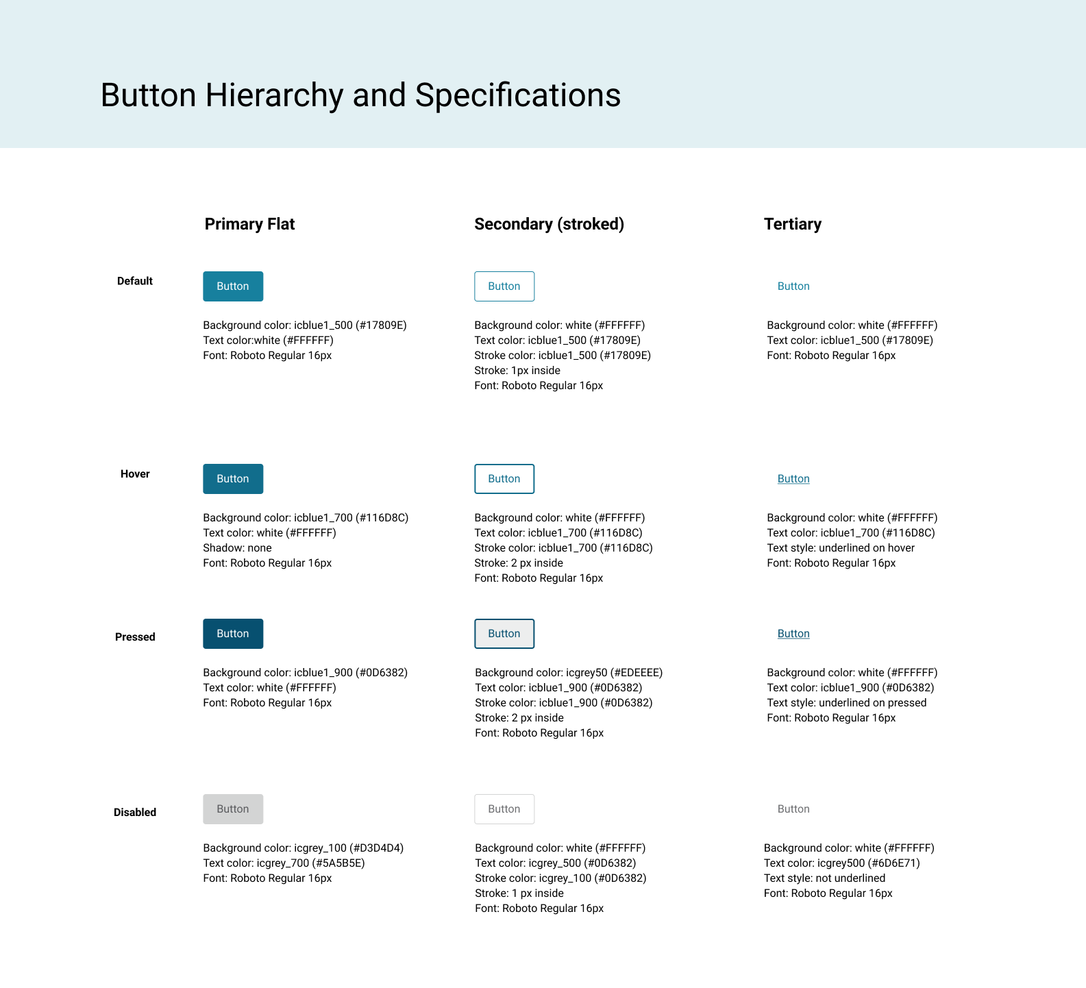
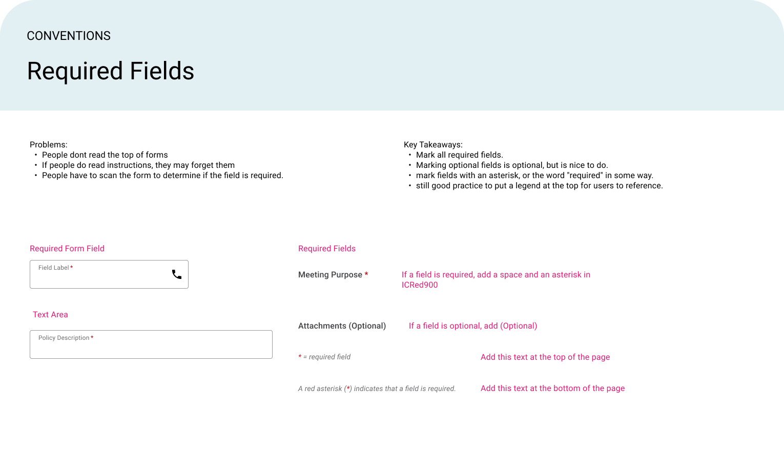
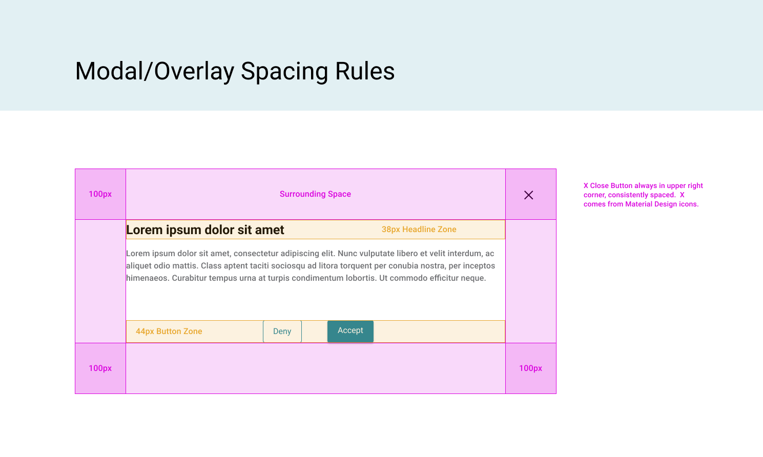
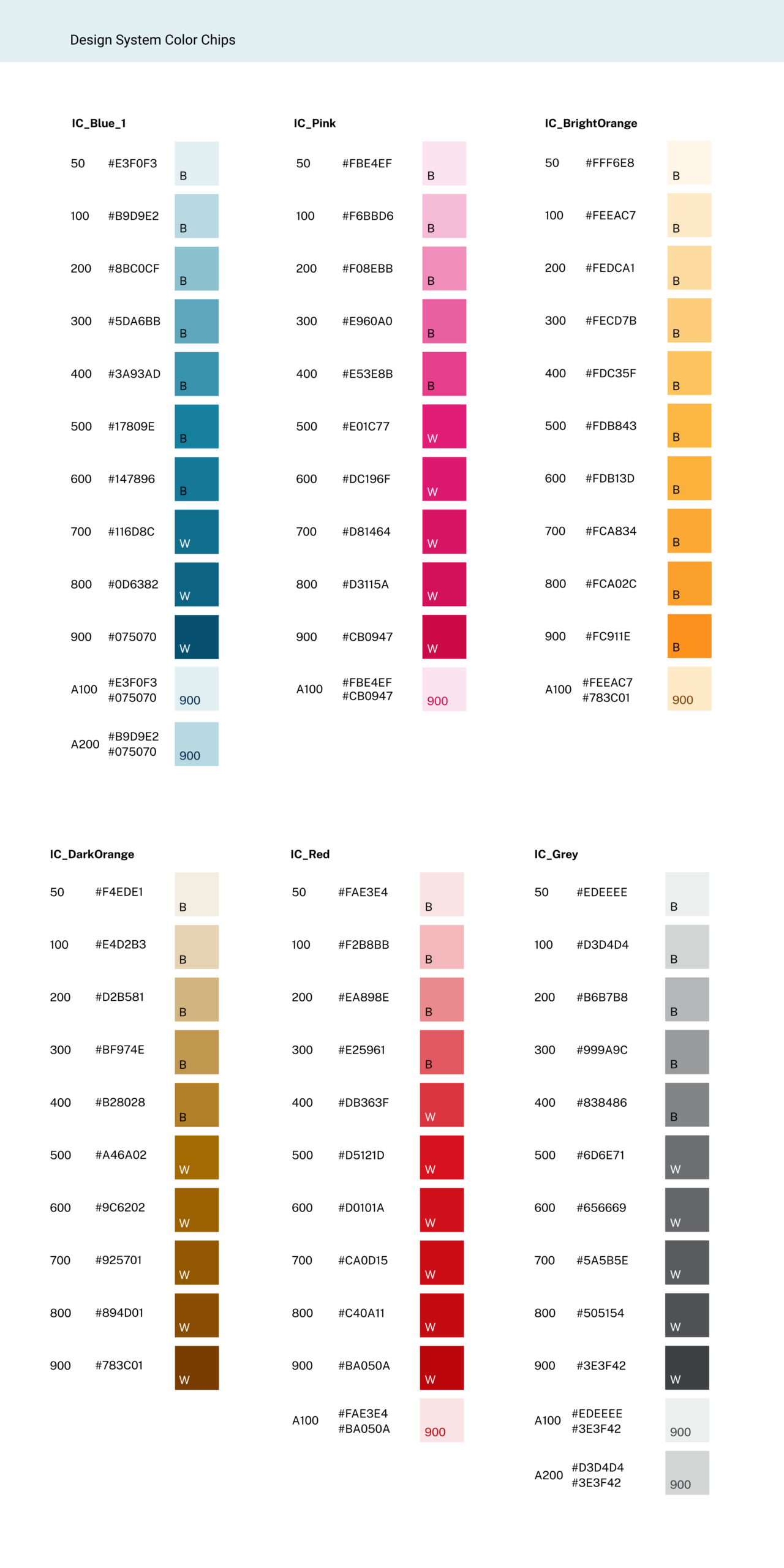
I first started with an ADA compliant color palette and a reusable typography system, then standardized controls and patterns to create a solid reusable design kit. This software was based on Material Design/Angular and benefited from close collaboration with front-end development team.
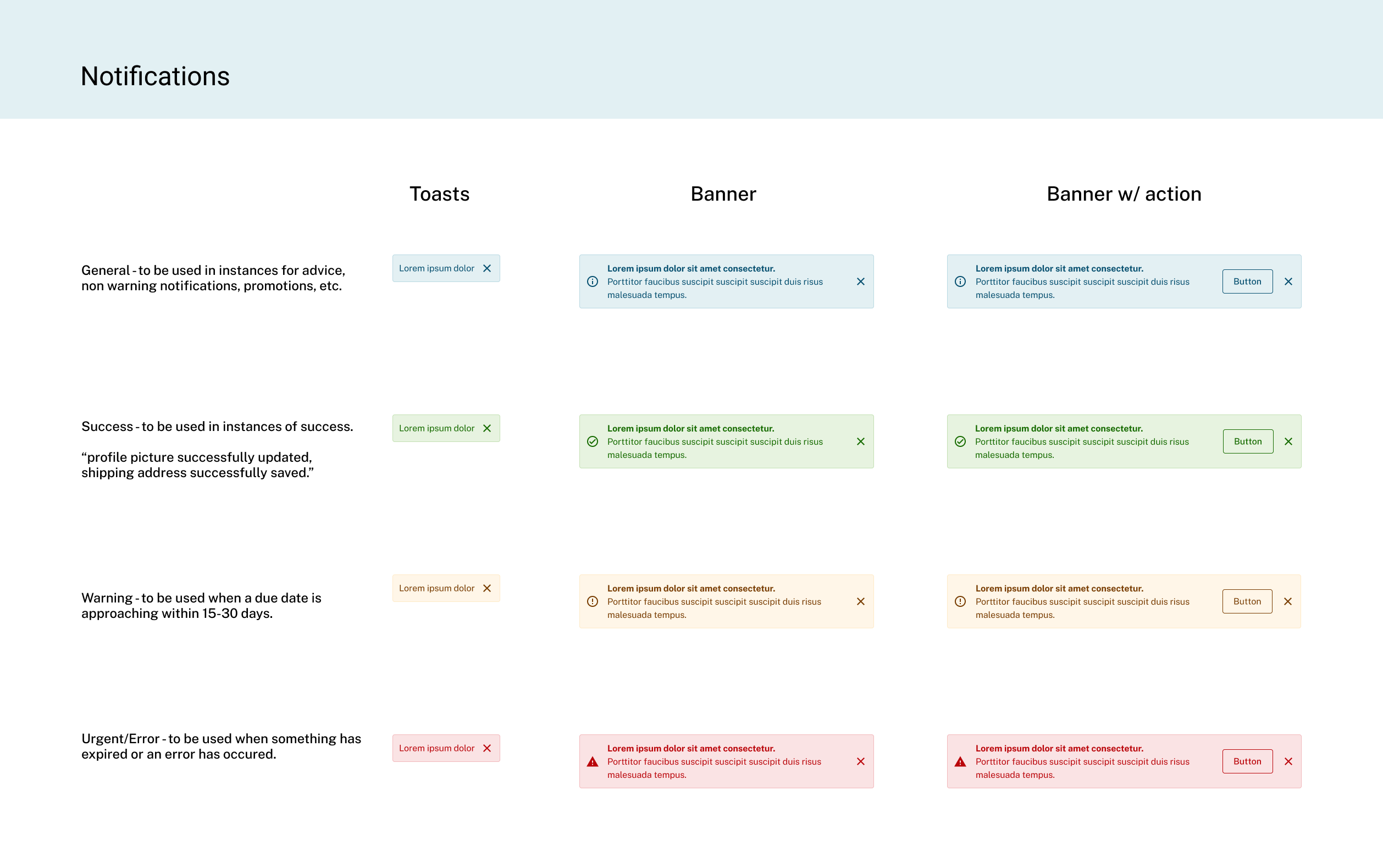
The Results
Our design system increased consistency and ease of use for the development team.