Zoe’s Kitchen Rewards App
Designing a new B2C customer rewards mobile application.
Project Summary
Zoe’s Kitchen needed a modern rewards application that allowed users to order food and check rewards.
The Challenge
This was a brand new program and nothing like this had existed for Zoe’s Kitchen. I meticulously mapped out the user flows and carefully designed each screen within the app to prioritize an intuitive and user-friendly experience. The process involved creating detailed diagrams to visualize the user journey, ensuring that every step was logically connected and easy to follow.
The Solution
I developed a concise and user-friendly system architecture for users to easily access and understand their rewards information and also order food. This streamlined structure ensures a seamless and efficient experience, emphasizing clarity and ease of navigation.
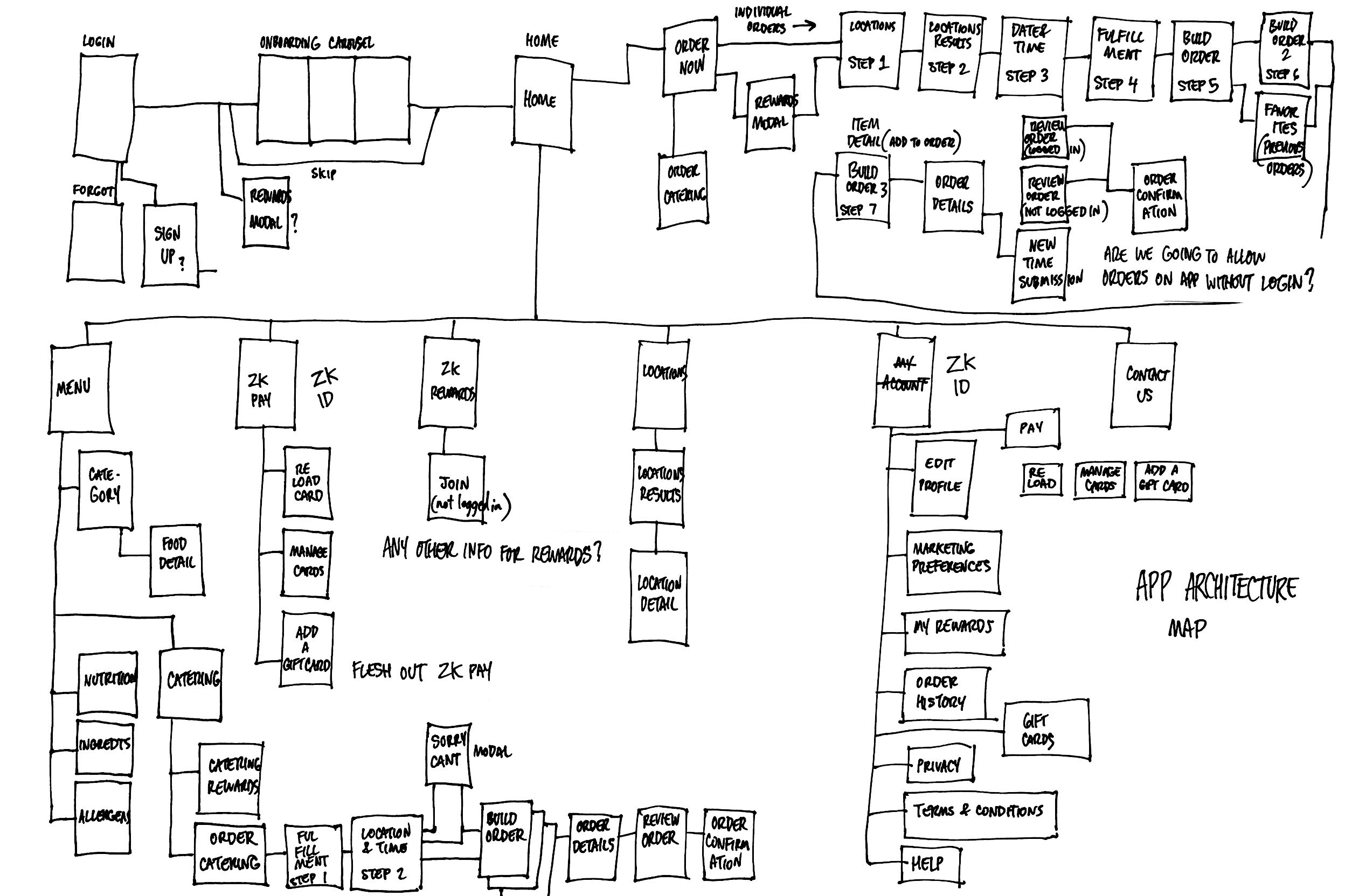
-Shown: I hand-sketched this first pass attempt at mapping all needed screens and relationships.
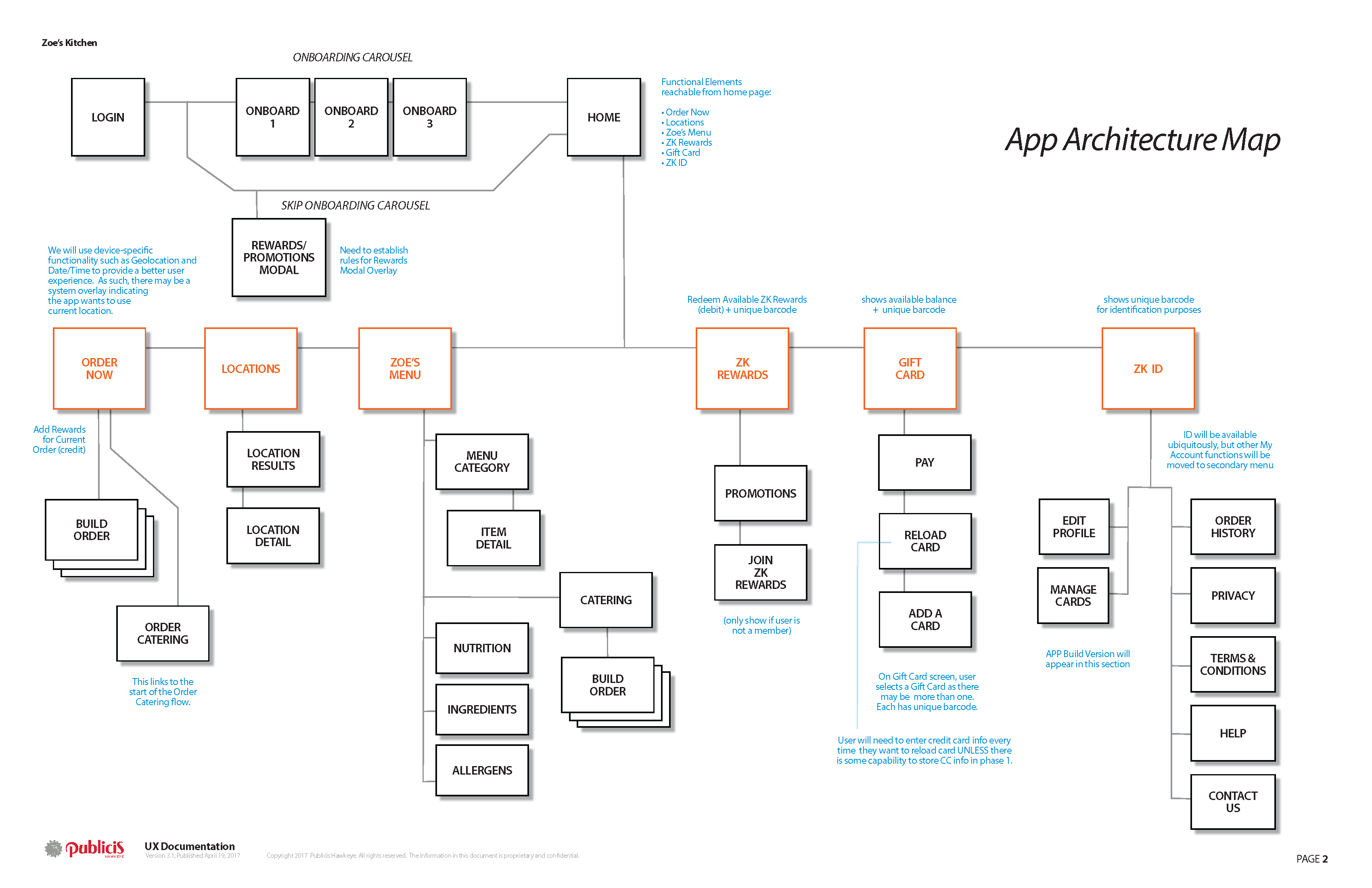
Shown: finished application map, as part of documentation.
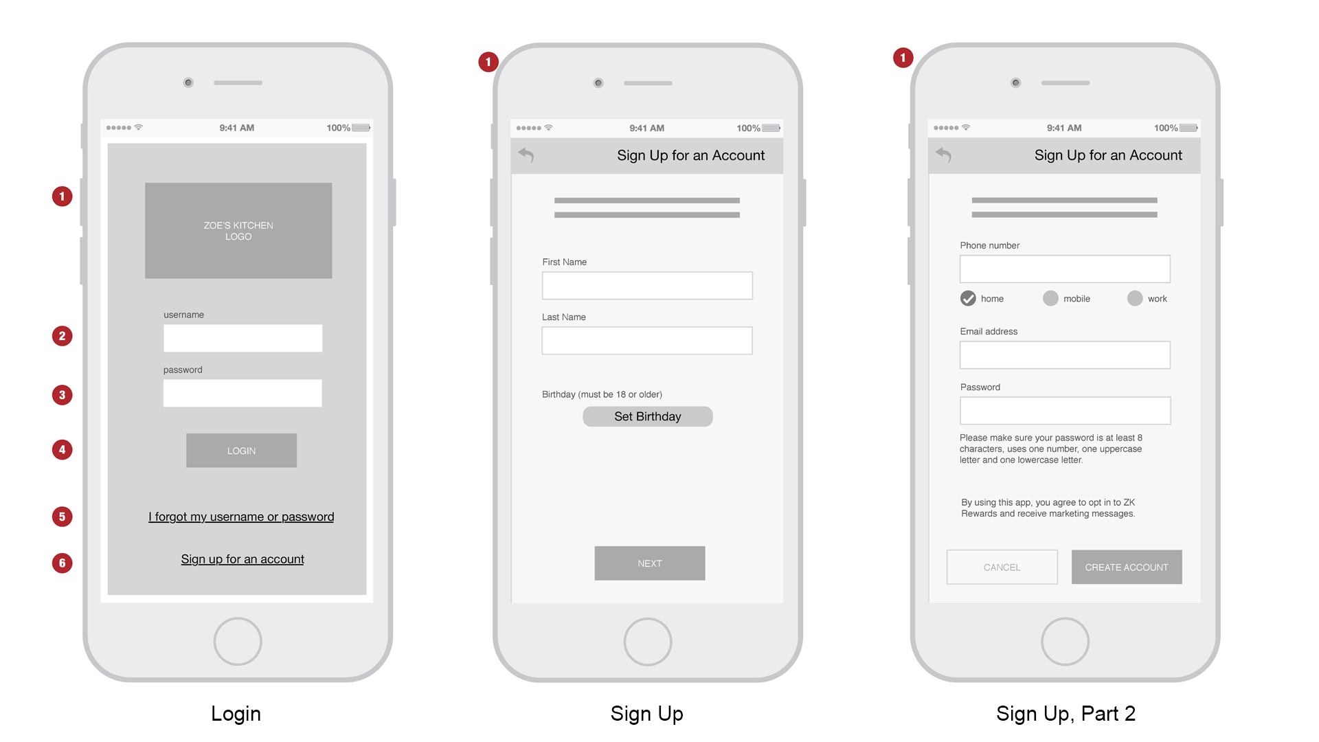
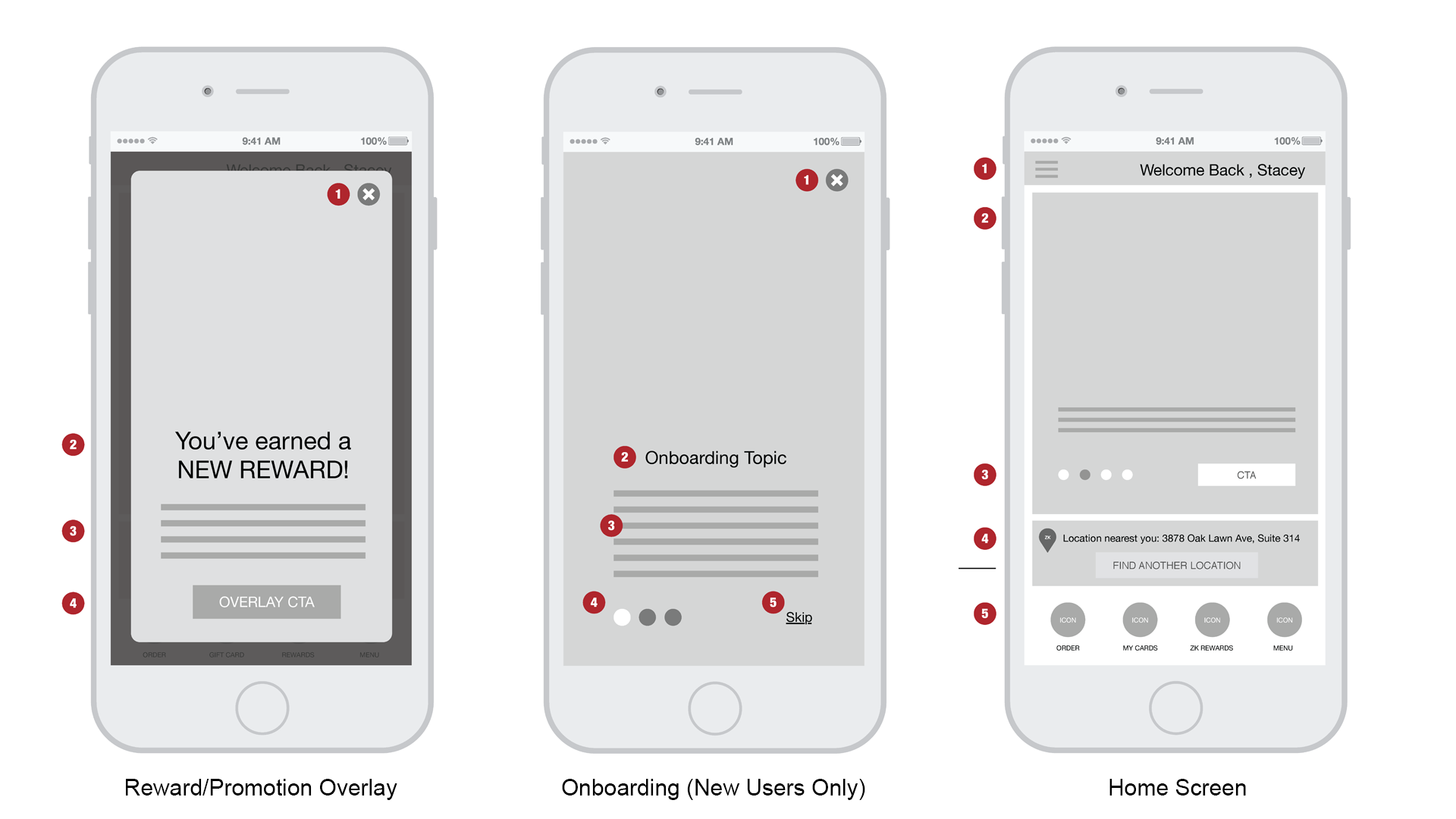
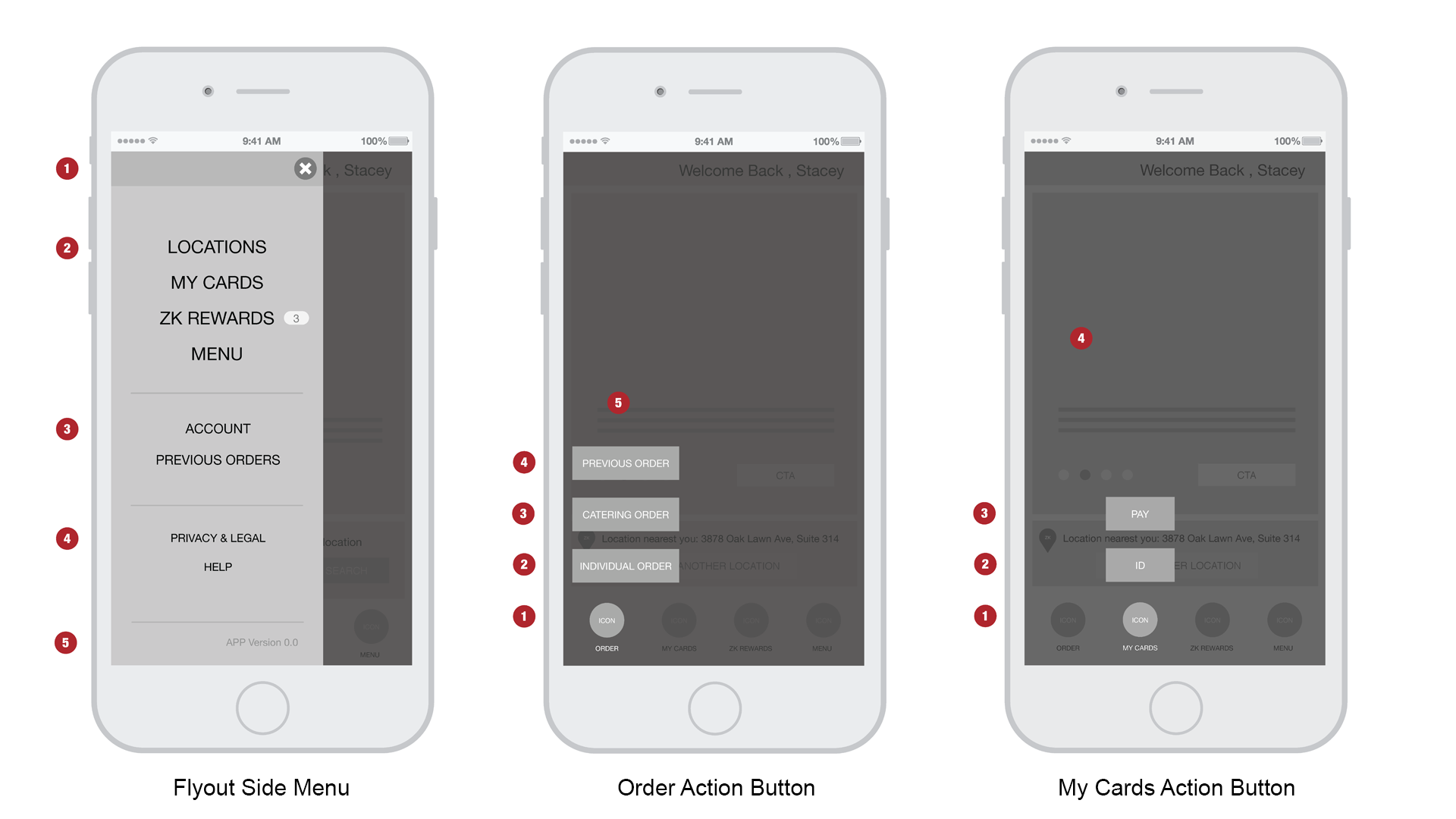
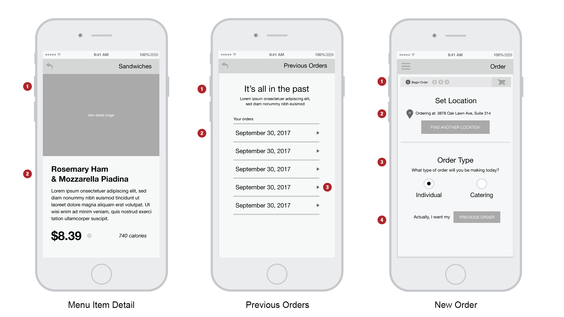
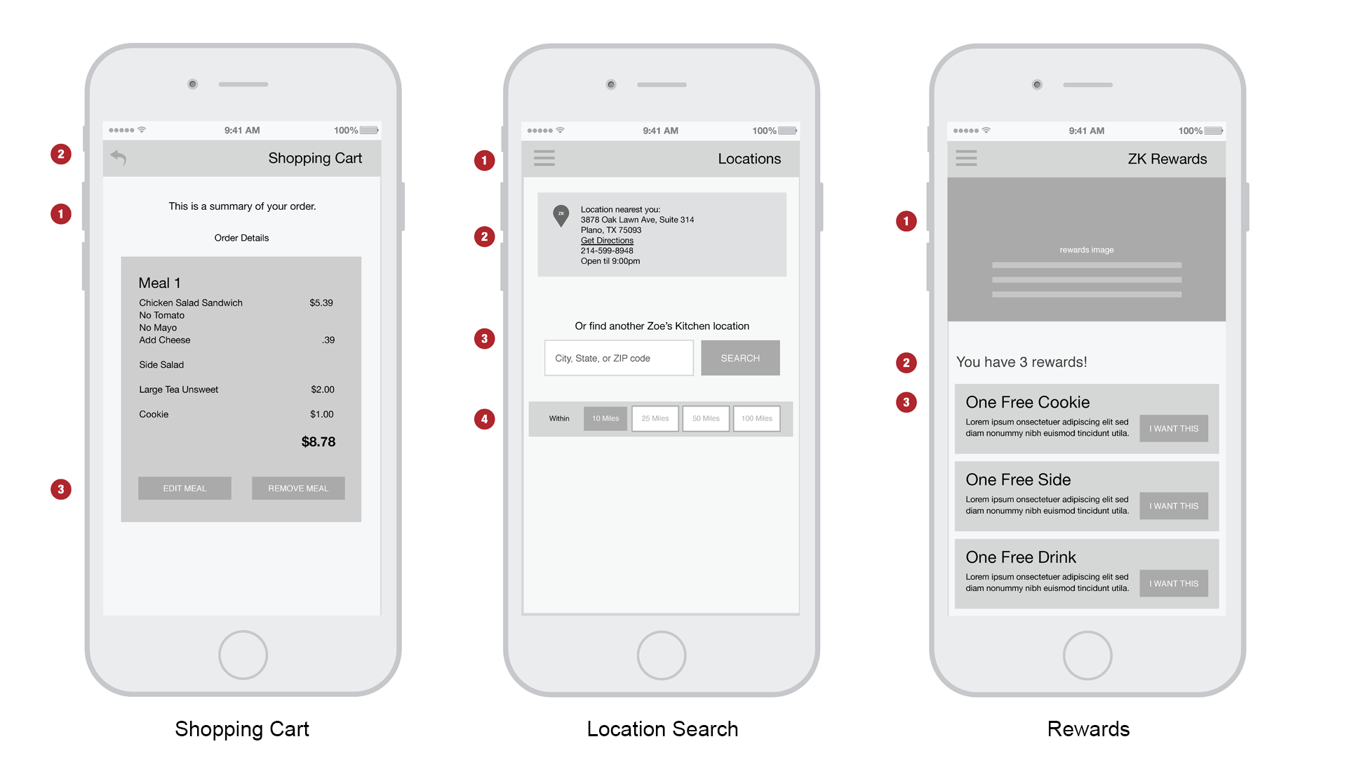
Shown: sample wireframe screens, no room to display all relevant documentation.
The Results
This app provided Zoe’s Kitchen’s customers with ease of use and increased satisfaction.